My initial ideas. I decided not to use the "Cat Mom" idea because I didn't realize how many versions people already made, any idea I had was practically taken, but I'm happy with the two I stuck with!
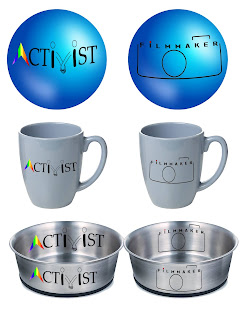
My 3D Models of my favorite designs. I chose the word activist because I believe it is really important to consider yourself a human rights activist forever and always. I didn't want my logo to look too hectic with multiple symbols, but I chose to include a rainbow since I consider myself an ally of the LGBTQ+ community and hands holding to connect at the V to showcase "loving thy neighbor". I chose the filmmaker logo because it was a different route than my activist logo. Sometimes it's hard to stick to simplicity but I really like how this one turned out. I found the font off of dafont.com and I think it works so well with my overall style. I also think adding the red dot can be a fun little advertising gimmick as I included it to dot the I's in my last name on my business cards.